
BOOK COVER PAGE DESIGNS
Call us for the Best Book Cover Designs. +233549617762/+23324734462
Call us for the Best Book Cover Designs. +233549617762/+23324734462


Book Page Layout and Designs
Most writers know that a great cover is a necessity when self-publishing a book. It grabs a potential reader’s attention and tells them, in subtle and not-so-subtle ways, what to expect from your story. Unfortunately the inside pages (referred to as the book’s “interior”) are sometimes not given as much thought or attention.
Book designer
Erik Spiekermann once wrote, “I have seen too many books with great covers but
horribly designed content. It’s like great packaging, but when you open it, the
food inside looks brown and boring. It may still be nourishing, but my appetite
is gone.”
- @espiekermann
"I have seen too many books with great covers but horribly designed content.
Whether a
book will ultimately be read on paper or an e-reader, interior book design can
make or break a reader’s enjoyment of a book. Book layouts are particular and
definitely not one-size-fits-all. The design also must be adjusted for the
style and genre of
the book. For example: an art book should never crowd the graphic elements with
too much text—the point is the reader wants to see the art! A sloppy, rushed or
mismatched book layout sends a bad message to the reader and can make the book
difficult or tiresome to read.
A strong book
interior is pleasing and well-balanced in two important areas: typesetting
(font, type size, space between the lines, and hyphens that break the lines)
and layout (margins, columns, and illustrations and art).
This article
will take you through basic elements (and most common pitfalls) of both
typesetting and layout design. If you keep these in mind and understand their
importance, your next book layout will be a success.
 |
| A well-layed-out book |
Trim size
—
Selecting a
trim size is the first step in the book layout project. Will it be a standard
size (like 5.5 x 8.5 or 6×9), which is best for the long chapters of a novel or
memoir? Or maybe a wide art book with a small caption of text on each page and
lots of room for large photographs?
If your book
is over 250 pages, a small trim size (5 x 8 or smaller) will create a thicker
book, which can turn off a potential book buyer. If you write poems with long
lines you might choose a wider format so your lines won’t have to break.
You’ll
also need to choose whether
you want a paperback, a hardback with dust jacket, or a casebound with the art
printed directly on the cover. Hardback and casebound books carry higher
production and shipping costs.
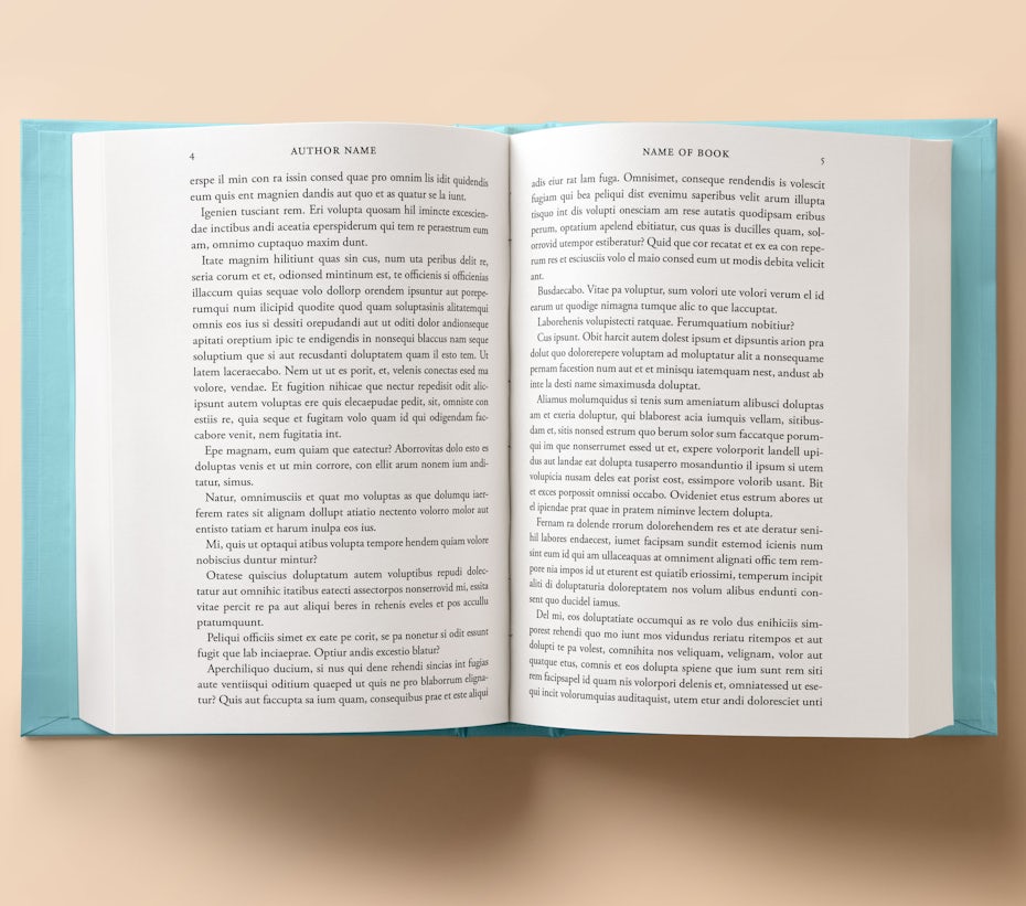
Margins
—
—
Even though
they are technically blank space, margins are perhaps the most important part
of a book layout. A book page has three margins (outside, top, bottom) and a
gutter (the inside margin where the pages are glued or sewed together). Each of
those margins has a particular job: the outside margins give room for the
reader’s thumbs when they hold the book.
The top
margin is where you’ll usually find the author and name of the book, as well as
the page number (more on those later!). The bottom margin provides a pillow of
white space that supports your text block. The gutter makes sure the text
doesn’t slip into the glue area. Traditionally, the outside, top, and bottom
margins are close in size (often around half an inch each), while the gutter is
the largest (usually .75 – .9 inches).
|
| Incorrectly spaced margins make a book feel off-balance. |
Typography basics
—
—
The next
thing to settle on is typeface. Books are traditionally set in serif fonts like
Garamond, Caslon, Baskerville and Goudy, but guidebooks, art books, cookbooks,
and other genres use sans-serif for their modern feel and for ease of reading.
Whatever font
you choose, make sure it’s legible and well-suited for book layouts. Make sure
it has italics, semibold, bold and small caps all included. Commercial books
(like thrillers and mysteries) are usually set a bit bigger because their
audience tends to be older. A comfortable size for most books is 11pt font.
Equally
important is the white space between the lines, known as “leading.” Leading makes
sure your readers can read your book without getting a headache from all those
lines jammed together. Because books with more pages cost more money, there’s
an incentive to cheat and get as many lines on a page as possible. You may save
a few cents on each book, but your design (and its readability) will suffer. As
a general rule, aim for 33-36 lines on each page.
Running heads and feet
—
—
Running heads
are the little lines at the top of the page that give the reader all the
pertinent info—author, book name, and page name—as they read. Sometimes the
page number will be at the bottom of the page, making it a “foot.” They help
the reader chart her progress in the book and find her way back if she loses
her place. Usually centered or placed slightly to the left and right of the
text margins, running heads and feet also provide a nice visual frame to your
text block. They should be small enough to not intrude on the text, while still
legible and clear.
Art and images
—
—
If your book
has photographs, illustrations, or art of any kind, the layout must be designed
to accommodate them. Depending on the genre, the text and art will interact in
different ways. If you’re writing a children’s book, the very small amount of
text per page will go right on top of the art. If it’s a cookbook,
you might want a photograph of the food on the left, with a two-column recipe
on the right. A true photography book might have large, beautiful photos on
each page, with simple captions under the photos and a brief introduction by
the artist at the beginning. Always give the art room to breathe—one great
photo is often more effective than a collage of many.
Signature details
—
—
These are the
fun little details that really make a design pop and separate a well-designed
book interior from one cranked out from a template. It’s essential to start
your chapters or sections deep on the page (called a “sink”) to create visual
cue for the reader and give them a mental break before they dive into the new
material.
The sink is a
great place for a graphic element or fun type design. Add a dramatic drop cap
or set the first line in a different type. (Here’s a tip: use that secondary
font again in your running heads to create a motif!) Within the chapter, a cute
graphic can be added to clearly define sections and bring a little visual flair
to your page. Make sure it’s small and fits the aesthetic of your interior.
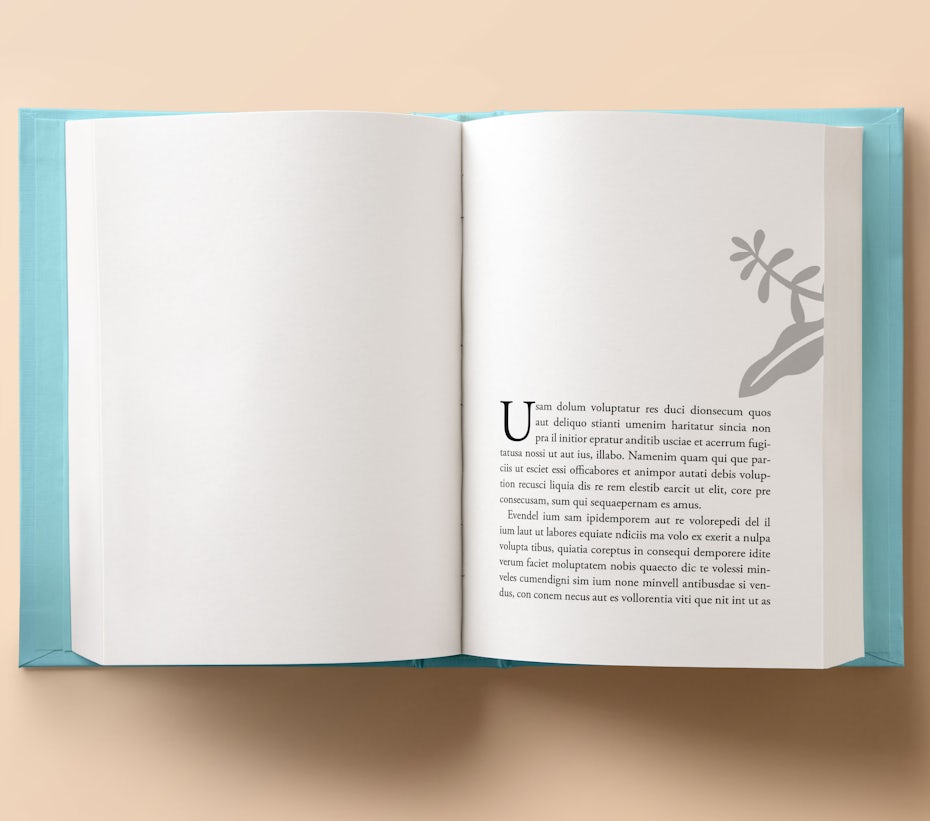
A sink and drop cap let the
reader know a new chapter is starting. The graphic is an optional, signature
detail that gives the book some personality.
Common mistakes
—
—
The most
common mistake in a book layout is not leaving enough white space. Make sure
your margins are ample and your leading is generous, without looking gappy.
Word processor documents do not make good book interiors—be sure to change double
dashes to the longer em dashes and take out the tab space most programs add
automatically at the beginning of each paragraph.
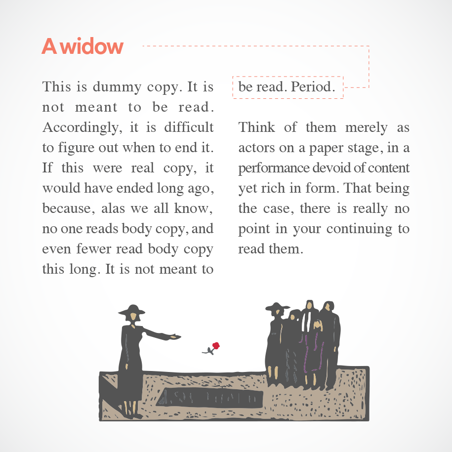
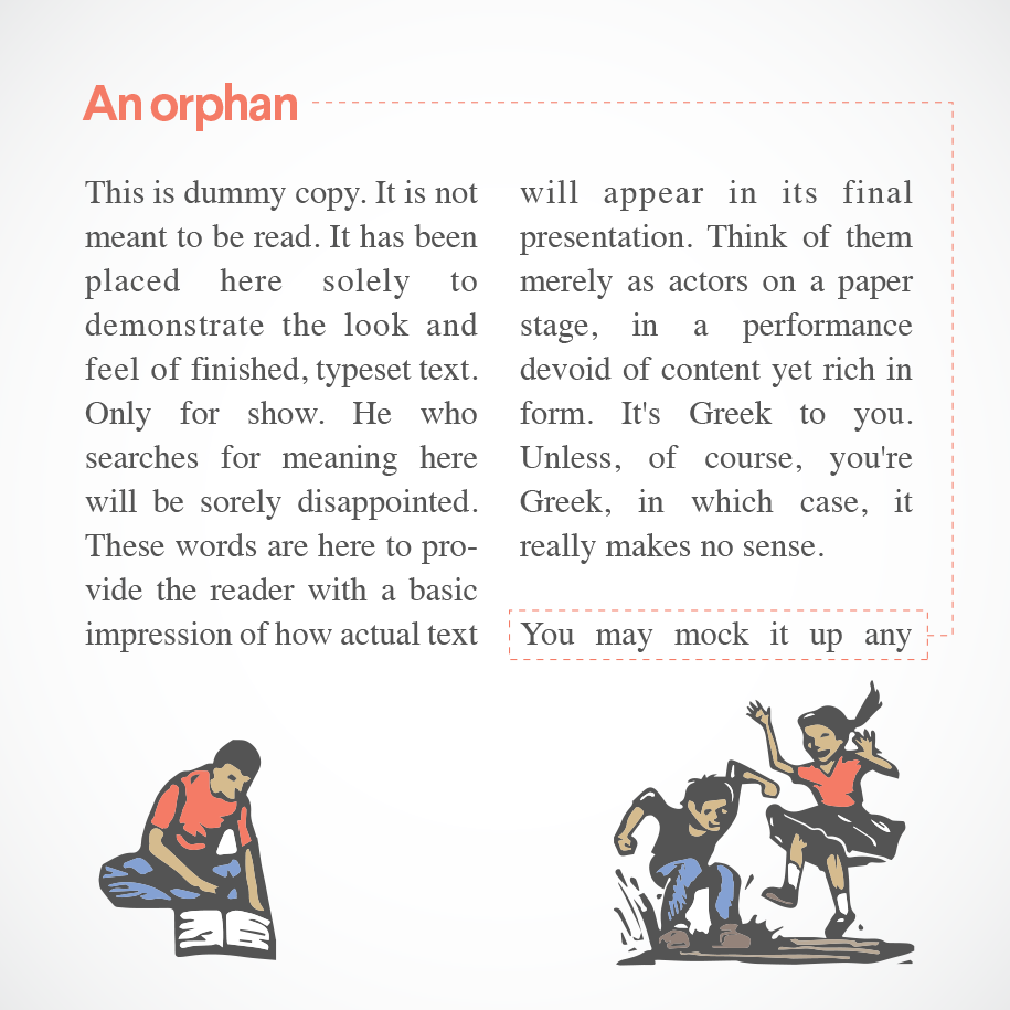
Understand
that hyphenated words at the end of lines are unavoidable but make sure the
word doesn’t break to create a different word—like “overpowering” becoming
“over-powering”— which can confuse your reader. Keep an eye out for single
lines marooned at the bottom (“orphan”) or top of a page (“widow”) with no
paragraph to support them.
Get a great book layout design for your masterpiece
—
—
A strong
layout is a collection of small decisions on the designer’s part. From leading
to font choice to margin size, the most important principle is strict
consistency—if you make a design decision on page three, you have to be willing
to stick with it through two-hundred or more pages!
Before diving
into your book layout project, think carefully on these six areas of the page:
trim size, margins, typeface, running heads and feet, art and images, and
contrasting lead lines. Thoughtful decisions at the outset of the book layout
will ensure the process runs much more smoothly and the final product will be
well-appointed and comfortable for the reader’s eyes.


